Solid Design Foundation - Ready to Level Up
Strong brand execution with clear opportunities for elite-tier improvements
Score Breakdown
Summary
Your design demonstrates excellent brand consistency and solid visual hierarchy fundamentals. With strategic refinements to spacing and micro-interactions, you're positioned to reach elite-level user experience.
Strengths
Excellent brand color strategy with strategic red accent usage
Strong typography hierarchy using Airbnb Cereal consistently
High contrast ratios meeting accessibility standards throughout
Areas for Improvement
Spacing & Rhythm Issue 1
Good responsive adaptation from desktop grid to mobile card layout
Recommendation
Establish more consistent vertical spacing between sections
Spacing & Rhythm Issue 2
Adequate breathing room around property cards and sections
Recommendation
Increase padding around mobile property cards for better touch targets
Micro-interactions Issue 1
Heart icons and buttons have clear interactive affordances
Recommendation
Add hover states for property cards to improve discoverability
Micro-interactions Issue 2
Search button with magnifying glass icon provides clear call-to-action
Recommendation
Include loading states for when property images are loading
Visual Hierarchy Issue 1
The search bar is clearly the primary focal point with strong visual weight and positioning
Recommendation
Increase contrast between section headers and property cards to strengthen information layers
Visual Hierarchy Issue 2
Property cards have good hierarchy with images dominating and text appropriately subordinated
Recommendation
Consider reducing visual noise from multiple 'Guest favorite' badges that compete for attention
Typography Issue 1
Airbnb Cereal VF provides excellent brand consistency and readability across all elements
Recommendation
Ensure consistent line-height ratios across all text elements
Typography Issue 2
Good scale progression from section headers to property titles to metadata
Recommendation
Consider slightly increasing body text size on mobile for better accessibility
Color & Contrast Issue 1
Strong brand color (rgb(255, 56, 92)) is used strategically for CTAs and heart icons
Recommendation
Consider adding a secondary accent color for variety in interactive elements
Color & Contrast Issue 2
Excellent use of neutral grays for content hierarchy without overwhelming
Recommendation
Ensure consistent color treatment for similar UI states across all components
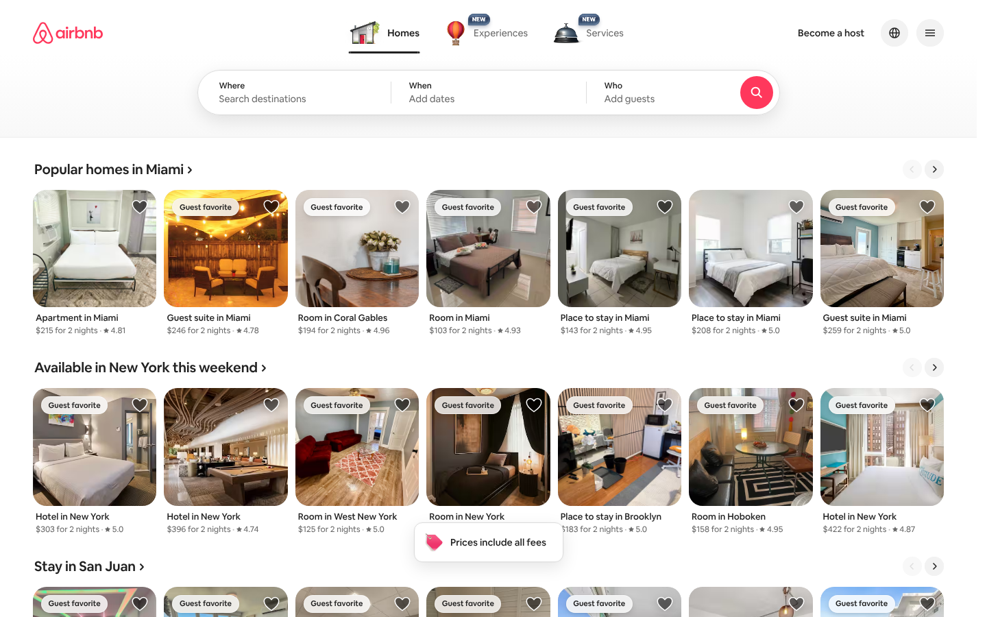
Screenshot Analyzed
Ready to level up your design?
A professional polish could push you to the next tier.