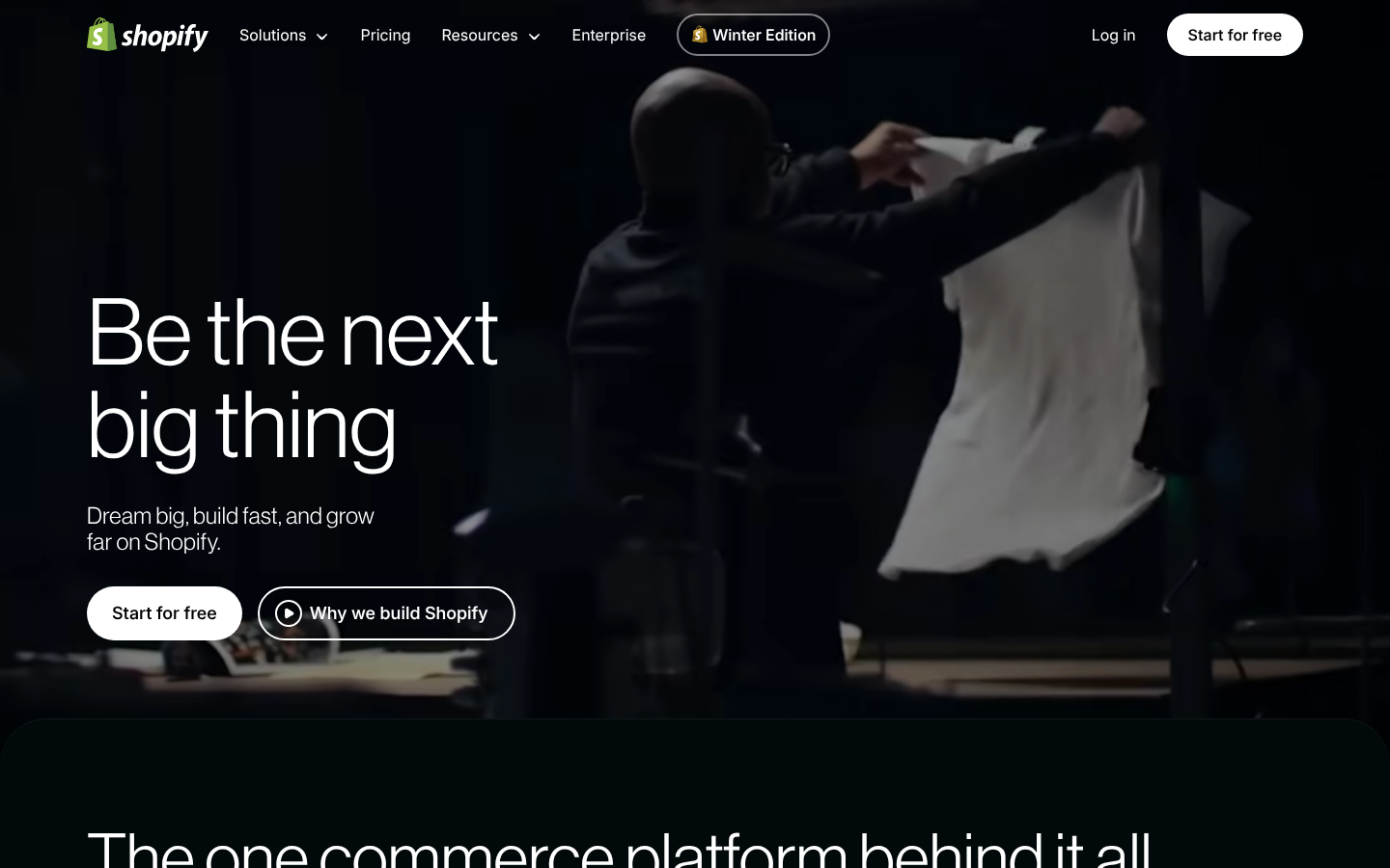
Strong Foundation, Ready for Elite Status
Your design scores 74/100 with excellent typography and visual hierarchy
Score Breakdown
Summary
Your website demonstrates strong professional design principles with sophisticated typography and clean visual hierarchy. The monochromatic palette creates a premium brand presence that's polished and cohesive. With a few strategic improvements, you're positioned to break into elite territory.
Strengths
Sophisticated Inter-Variable and NeueHaasGrotesk typography pairing
Excellent visual hierarchy with strong focal points and clear information flow
Clean monochromatic palette creates premium, professional brand positioning
Areas for Improvement
Micro-interactions Issue 1
CTAs have clear button styling that suggests interactivity
Recommendation
Add hover states and micro-animations to enhance interactivity feedback
Micro-interactions Issue 2
Overall polish level is high with clean, professional presentation
Recommendation
Implement loading states and transition effects for a more premium feel
Visual Hierarchy Issue 1
The hero headline 'Be the next big thing' creates a strong focal point with excellent size contrast
Recommendation
Consider adding more visual separation between sections to strengthen the layering
Visual Hierarchy Issue 2
Clear progression from main headline to subtext to CTAs establishes proper information hierarchy
Recommendation
The secondary headline could use slightly more breathing room from the primary CTA
Typography Issue 1
Inter-Variable and NeueHaasGrotesk create a sophisticated, modern pairing
Recommendation
Ensure the type scale follows a consistent mathematical ratio throughout all page sections
Typography Issue 2
Type scaling appears consistent across desktop and mobile views
Recommendation
Consider slightly increasing contrast for smaller text elements
Color & Contrast Issue 1
The monochromatic palette with whites, grays, and near-blacks creates sophisticated cohesion
Recommendation
Add subtle accent colors for CTAs to improve conversion potential
Color & Contrast Issue 2
Dark background with white text provides strong contrast for readability
Recommendation
Ensure all interactive elements have sufficient contrast ratios
Spacing & Rhythm Issue 1
Good use of whitespace around the hero content prevents cramping
Recommendation
Implement a more consistent grid system for precise alignment
Spacing & Rhythm Issue 2
Responsive spacing transitions well between desktop and mobile views
Recommendation
Consider increasing spacing between CTA buttons for better touch targets on mobile
Screenshot Analyzed
Ready to level up your design?
A professional polish could push you to the next tier.