Strong Foundation, Ready to Level Up
Your design scores 75/100 with excellent typography execution
Score Breakdown
Summary
Linear.app showcases solid design fundamentals with exceptional typography implementation and strong visual hierarchy. Your Inter Variable font usage creates a clean, professional experience that successfully communicates your value proposition across all devices.
Strengths
Exceptional Inter Variable typography with perfect scaling across devices
Strong contrast ratios meeting accessibility standards throughout
Excellent responsive spacing that adapts beautifully from desktop to mobile
Areas for Improvement
Micro-interactions Issue 1
Primary CTA buttons are well-designed with clear visual hierarchy and appropriate styling
Recommendation
Add subtle hover and focus states to enhance interactivity feedback
Micro-interactions Issue 2
Interactive elements like navigation items and buttons have clear affordances
Recommendation
Implement loading states and micro-animations to improve perceived performance
Visual Hierarchy Issue 1
The main headline creates a strong focal point with large, bold typography that immediately communicates the product's purpose
Recommendation
Consider adding more visual separation between the hero section and navigation to strengthen the hierarchy
Visual Hierarchy Issue 2
Information layering is well-executed with clear distinction between primary headline, supporting description, and call-to-action elements
Recommendation
Enhance the secondary messaging to create more distinct visual weight differences
Typography Issue 1
Inter Variable is excellently implemented with consistent scaling across different screen sizes
Recommendation
Fine-tune line heights for better vertical rhythm consistency
Typography Issue 2
Typography hierarchy is clear and readable with appropriate font weights and sizes for both desktop and mobile
Recommendation
Consider slightly increasing letter spacing for smaller body text to improve readability
Color & Contrast Issue 1
Strong contrast ratios with white text on dark backgrounds meeting accessibility standards
Recommendation
Expand the strategic use of accent colors to better guide user attention to key actions
Color & Contrast Issue 2
The purple accent color (#5E6AD2) is used strategically for interactive elements and branding
Recommendation
Consider adding a secondary accent color for better information categorization
Spacing & Rhythm Issue 1
Excellent responsive spacing that adapts well between desktop and mobile views
Recommendation
Establish a more consistent baseline grid system for better vertical rhythm
Spacing & Rhythm Issue 2
Good use of whitespace around key elements, particularly in the hero section
Recommendation
Improve alignment consistency across different content sections
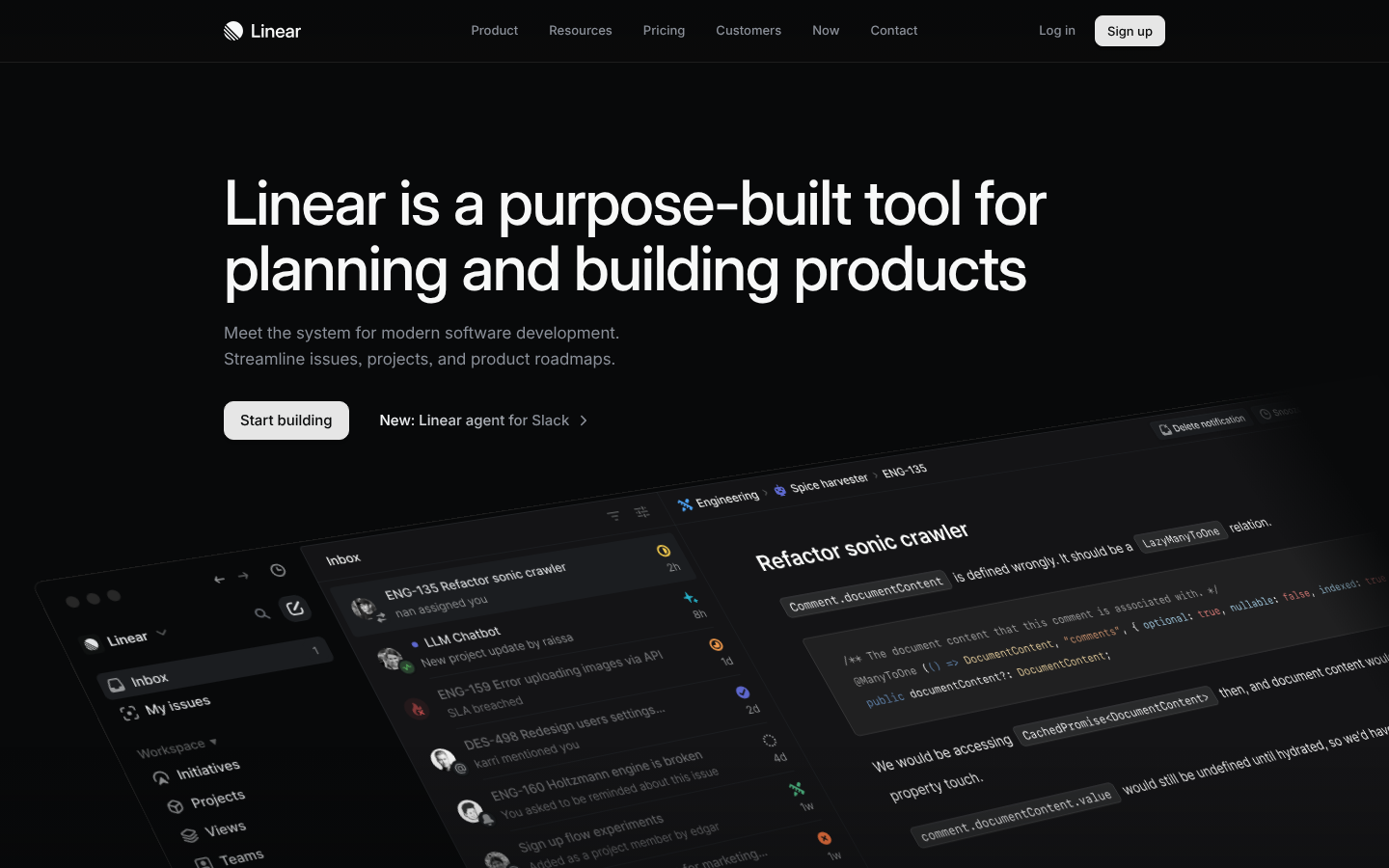
Screenshot Analyzed
Ready to level up your design?
A professional polish could push you to the next tier.