Strong Foundation, Elite Potential Within Reach
Your design scores 76/100 with standout color and typography execution
Score Breakdown
Summary
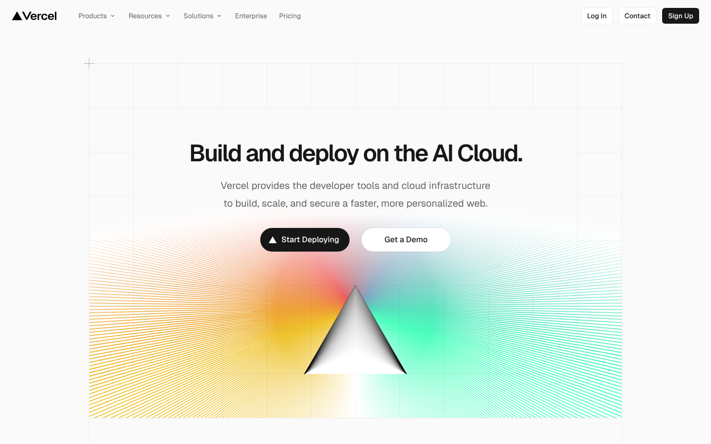
Vercel's landing page demonstrates solid design fundamentals with particularly strong color contrast and typography choices. The vibrant gradient background creates excellent visual impact while maintaining readability, and the Geist font family delivers a modern, professional aesthetic. With a few strategic improvements, this design could easily break into elite territory.
Strengths
Exceptional color contrast (83.4/100) with gradient background maintaining perfect readability
Strong typography execution using Geist font with consistent scale and hierarchy
Excellent responsive adaptation with thoughtful spacing adjustments across breakpoints
Areas for Improvement
Visual Hierarchy Issue 1
The main headline 'Build and deploy on the AI Cloud' serves as a strong focal point with excellent size and positioning
Recommendation
Consider slightly increasing the visual weight difference between CTAs to make the primary action more dominant
Visual Hierarchy Issue 2
Information is well-layered with clear primary (headline), secondary (description), and tertiary (navigation) elements
Recommendation
Add more visual separation between the hero section and navigation to strengthen the hierarchy
Typography Issue 1
Geist font family provides excellent readability and modern aesthetic across both desktop and mobile
Recommendation
Fine-tune line spacing in the descriptive text for optimal reading comfort
Typography Issue 2
The type scale appears consistent with appropriate sizing for headlines, body text, and UI elements
Recommendation
Ensure consistent vertical rhythm between all text elements
Color & Contrast Issue 1
The vibrant gradient background creates strong visual impact while maintaining text readability
Recommendation
Ensure the gradient doesn't interfere with text readability in all responsive breakpoints
Color & Contrast Issue 2
Excellent use of high contrast between dark text and light backgrounds for accessibility
Recommendation
Consider adding subtle color coding for different types of interactive elements
Spacing & Rhythm Issue 1
Excellent responsive spacing adaptation from desktop to mobile view
Recommendation
Implement a more consistent grid system for element alignment
Spacing & Rhythm Issue 2
Good use of whitespace around the main content area and buttons
Recommendation
Standardize spacing increments throughout the design system
Micro-interactions Issue 1
Buttons have clear visual hierarchy with the primary 'Start Deploying' button being more prominent
Recommendation
Add visible hover states and interaction feedback for all clickable elements
Micro-interactions Issue 2
Clean, polished appearance with well-crafted visual elements like the triangular logo
Recommendation
Implement loading states and transition animations for better user feedback
Screenshot Analyzed
Ready to level up your design?
A professional polish could push you to the next tier.