Solid Foundation, Ready to Level Up
You've nailed the basics with strong hierarchy and clean typography
Score Breakdown
Summary
Your design demonstrates excellent fundamentals with clear visual hierarchy and professional typography. The clean aesthetic and strong contrast create a solid user experience that's primed for optimization.
Strengths
Compelling headline hierarchy with excellent size contrast
Professional Switzer typography with good readability
Strong color contrast meeting accessibility standards
Areas for Improvement
Micro-interactions Issue 1
Primary CTA button has good visual prominence with dark background treatment
Recommendation
Add subtle hover effects and transitions to improve interactive feedback
Micro-interactions Issue 2
Interactive elements are identifiable but lack sophisticated hover states
Recommendation
Implement loading states and micro-animations to enhance the premium feel
Visual Hierarchy Issue 1
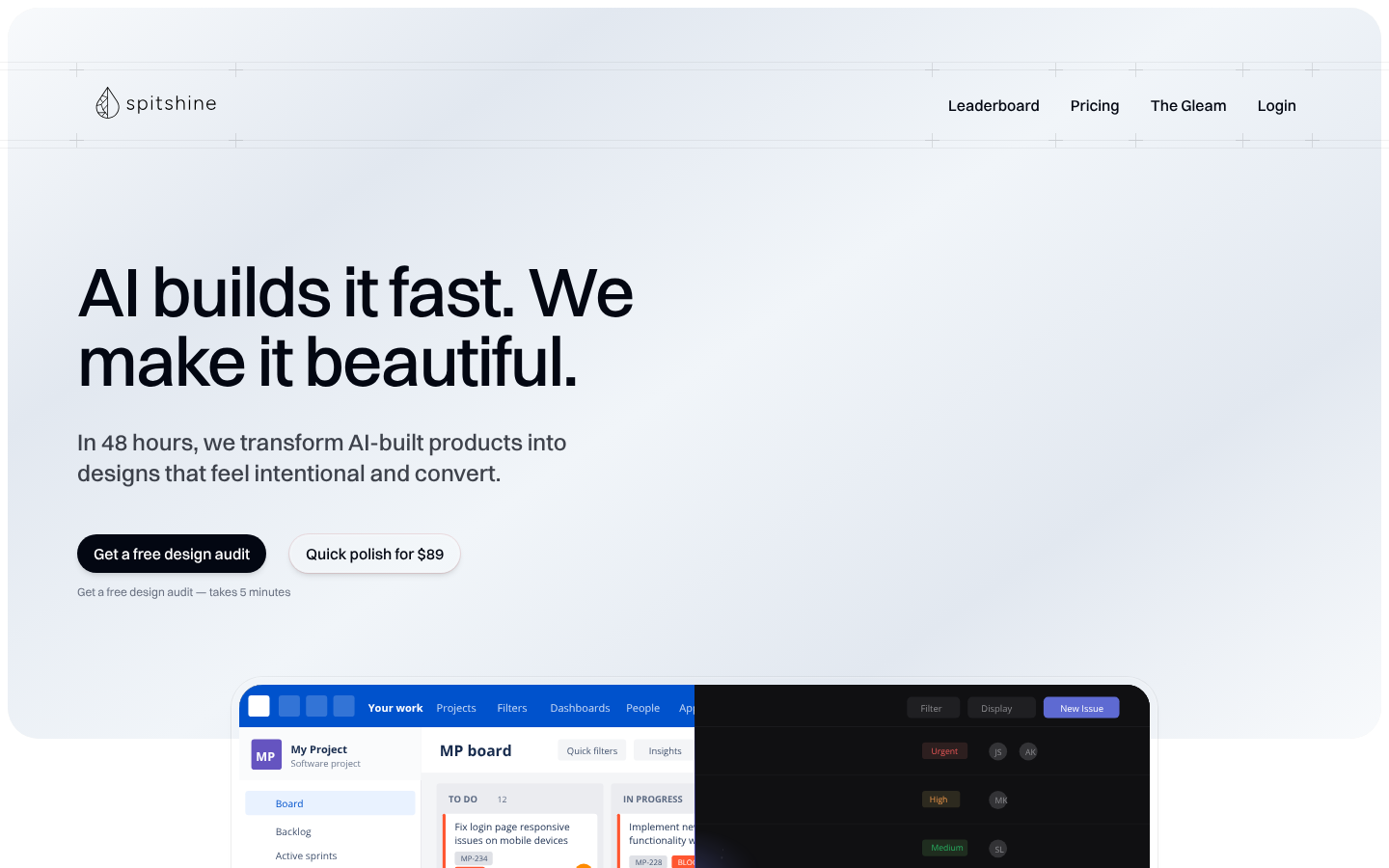
The main headline 'AI builds it fast. We make it beautiful.' serves as a strong focal point with excellent size contrast
Recommendation
Consider making the secondary CTA button ('Quick polish for $89') more visually distinct from the primary to strengthen hierarchy
Visual Hierarchy Issue 2
Information layers are well-defined with primary headline, secondary descriptive text, and clear CTA hierarchy
Recommendation
Add more visual separation between the hero section and the dashboard preview
Typography Issue 1
Switzer font provides excellent readability and modern feel appropriate for a tech product
Recommendation
Establish a more mathematically consistent type scale to improve visual rhythm
Typography Issue 2
Good contrast between headline and body text sizes, creating clear typographic hierarchy
Recommendation
Consider increasing the contrast between navigation text and body text sizes
Color & Contrast Issue 1
Strong contrast between dark text on light backgrounds meets accessibility standards
Recommendation
Add more strategic color differentiation to CTAs to improve conversion potential
Color & Contrast Issue 2
The minimal color palette with subtle accent colors creates a professional, clean aesthetic
Recommendation
Consider introducing a subtle brand accent color to enhance memorability
Spacing & Rhythm Issue 1
Good use of whitespace creates breathing room and prevents claustrophobia
Recommendation
Implement a more systematic spacing scale (8px or 4px grid) for pixel-perfect alignment
Spacing & Rhythm Issue 2
Responsive spacing adapts well between desktop and mobile views
Recommendation
Increase vertical spacing between major sections to improve content separation
Screenshot Analyzed
Ready to level up your design?
A professional polish could push you to the next tier.