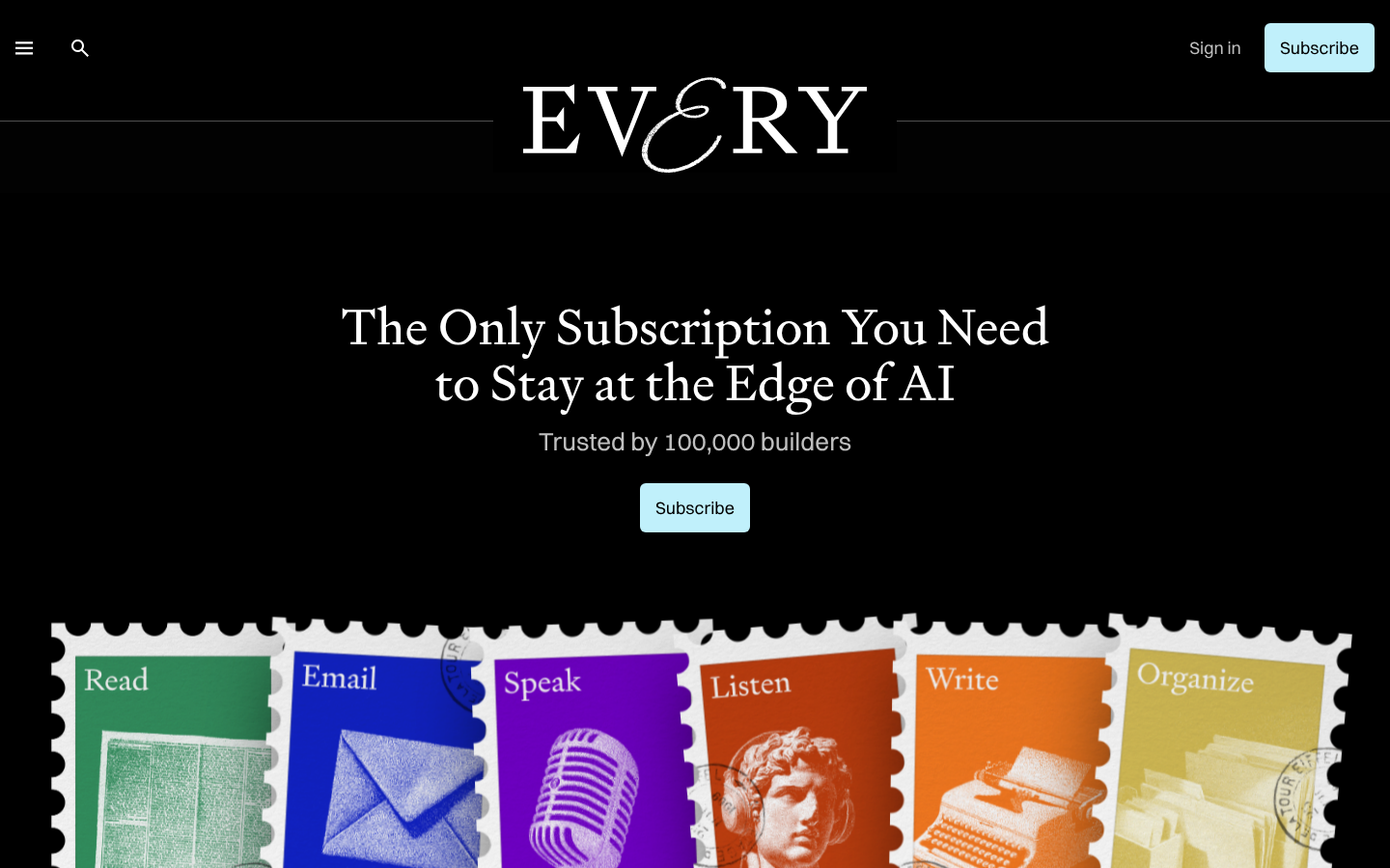
Strong Foundation - Ready to Level Up
Your design scores 75/100 with excellent typography and visual hierarchy
Score Breakdown
Summary
You've built a sophisticated, well-executed design with strong typography and clear information hierarchy. The stark aesthetic with strategic blue accents creates a professional impression that effectively communicates your AI-focused content.
Strengths
Exceptional font pairing with Switzer and Signifier creating sophisticated contrast
Strong contrast ratios ensuring accessibility with white text on black backgrounds
Well-established information hierarchy with clear primary/secondary content distinction
Areas for Improvement
Visual Hierarchy Issue 1
The main headline creates a strong focal point with excellent size and positioning
Recommendation
Consider reducing the number of competing elements below the fold to maintain focus
Typography Issue 1
Excellent font pairing with Switzer and Signifier creating sophisticated contrast
Recommendation
Fine-tune line spacing in body text for optimal readability
Color & Contrast Issue 1
Strong contrast ratios with white text on black background ensuring accessibility
Recommendation
Consider adding subtle color variations to break up the stark black/white scheme
Spacing & Rhythm Issue 1
Good use of whitespace creating breathing room around key elements
Recommendation
Establish more consistent grid alignment for smaller elements
Micro-interactions Issue 1
Subscribe buttons are well-designed with clear affordance and good visual weight
Recommendation
Add more subtle hover states and micro-animations to enhance interactivity
Component Consistency Issue 1
Strong design system cohesion with consistent button styling and spacing patterns
Recommendation
Ensure all interactive elements follow the same visual treatment patterns
Screenshot Analyzed
Ready to level up your design?
A professional polish could push you to the next tier.