Solid Foundation - Ready to Level Up
Strong brand presence with room for systematic improvements
Score Breakdown
Summary
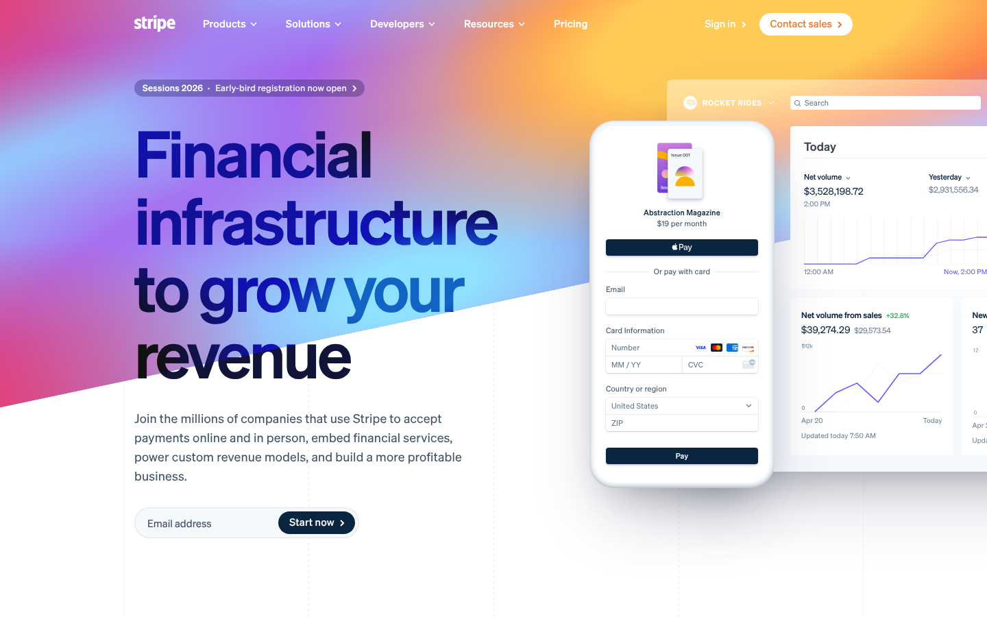
Stripe's design demonstrates professional execution with excellent gradient implementation and clear brand identity. Your color work and visual hierarchy create strong user guidance, but systematic improvements to typography and interactions could elevate this to elite status.
Strengths
Exceptional gradient background maintains readability while creating strong brand presence
Clear visual hierarchy guides users effectively from headline to CTA
Consistent component patterns across buttons and interface elements
Areas for Improvement
Micro-interactions Issue 1
CTAs have good visual prominence with clear button styling
Recommendation
Add more subtle hover and focus states to improve interaction feedback and accessibility
Visual Hierarchy Issue 1
The main headline 'Financial infrastructure to grow your revenue' creates a strong focal point with excellent size contrast
Recommendation
Consider increasing the contrast between the Sessions 2026 banner and main content to reduce competing focal points
Typography Issue 1
Strong use of Sohne variable font creates good brand consistency and readability
Recommendation
Establish a more systematic type scale with clearer mathematical progression between heading levels
Color & Contrast Issue 1
Excellent gradient background creates strong brand presence while maintaining text readability
Recommendation
Consider slightly increasing contrast on some secondary text elements for improved accessibility
Spacing & Rhythm Issue 1
Good responsive adaptation between desktop and mobile with appropriate spacing adjustments
Recommendation
Implement more consistent vertical rhythm with a systematic baseline grid approach
Component Consistency Issue 1
Strong consistency in button styling and overall component patterns
Recommendation
Ensure all iconography follows the same visual style and weight consistency across the interface
Screenshot Analyzed
Ready to level up your design?
A professional polish could push you to the next tier.