Solid Foundation with Elite Potential
Strong typography and accessibility, ready for the next level
Score Breakdown
Summary
Your website demonstrates professional design craft with excellent typography and accessibility compliance. The CursorGothic implementation creates strong brand identity while maintaining usability. With some strategic refinements, you're positioned to reach elite-tier design quality.
Strengths
CursorGothic typography creates distinctive brand personality with excellent readability
High contrast ratios ensure outstanding accessibility compliance
Strong design system consistency across components and responsive breakpoints
Areas for Improvement
Micro-interactions Issue 1
Button states are clearly defined with good hover affordances
Recommendation
Add more sophisticated loading states and transition animations to enhance the premium feel
Visual Hierarchy Issue 1
The hero headline creates a strong focal point with bold typography and clear positioning
Recommendation
Consider strengthening the visual weight difference between primary and secondary navigation elements
Typography Issue 1
CursorGothic provides strong brand personality while maintaining excellent readability
Recommendation
Ensure consistent line-height ratios are maintained across all responsive breakpoints
Color & Contrast Issue 1
The neutral palette with selective green accents creates professional, developer-focused aesthetic
Recommendation
Consider adding more strategic color coding to differentiate interface sections and guide user attention
Spacing & Rhythm Issue 1
Responsive spacing adapts well between desktop and mobile with appropriate scaling
Recommendation
Implement more consistent vertical rhythm with a stricter baseline grid system
Component Consistency Issue 1
Strong design system adherence with consistent button treatments and card components
Recommendation
Standardize icon stroke weights and sizes for better visual harmony across all interface elements
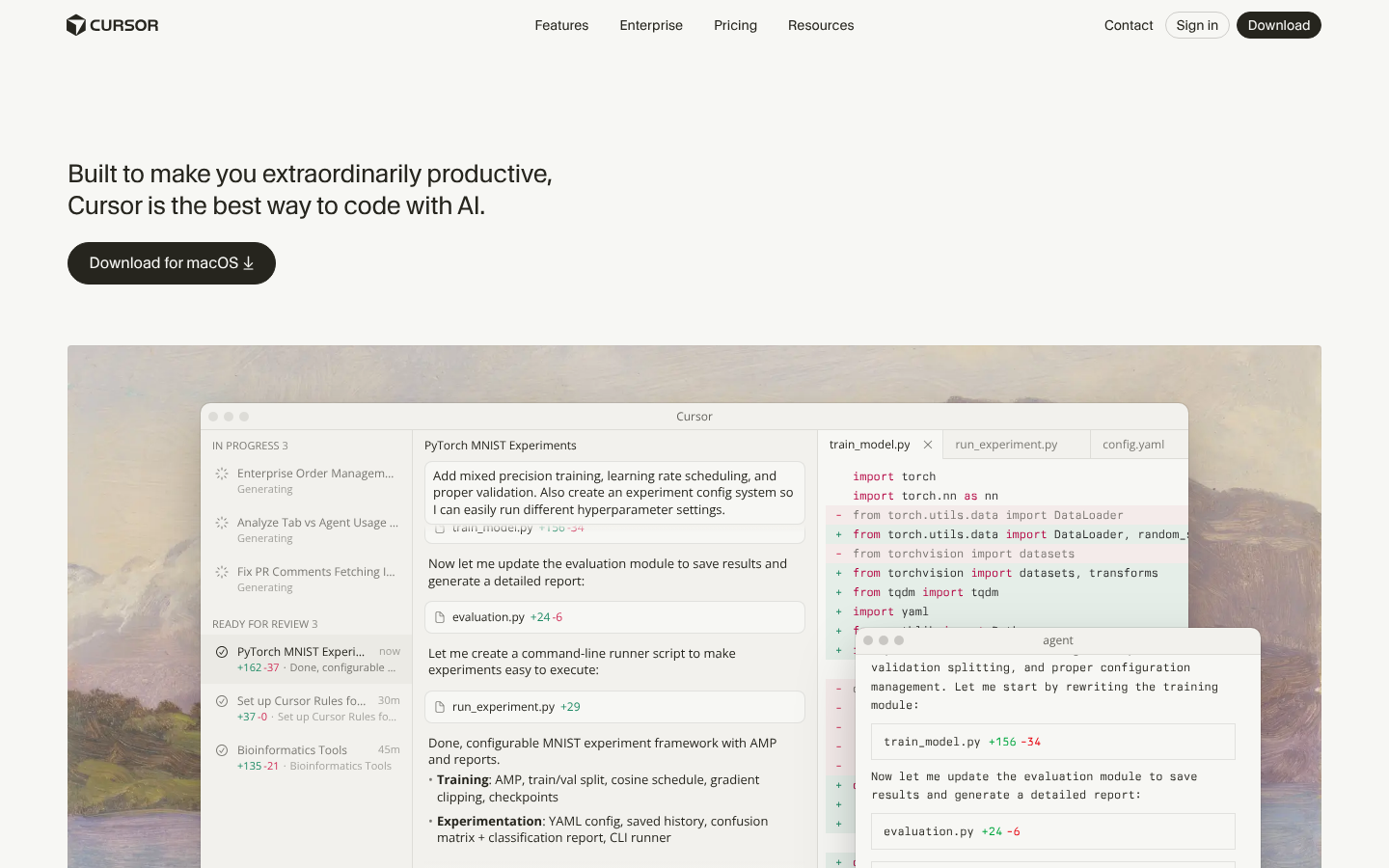
Screenshot Analyzed
Ready to level up your design?
A professional polish could push you to the next tier.