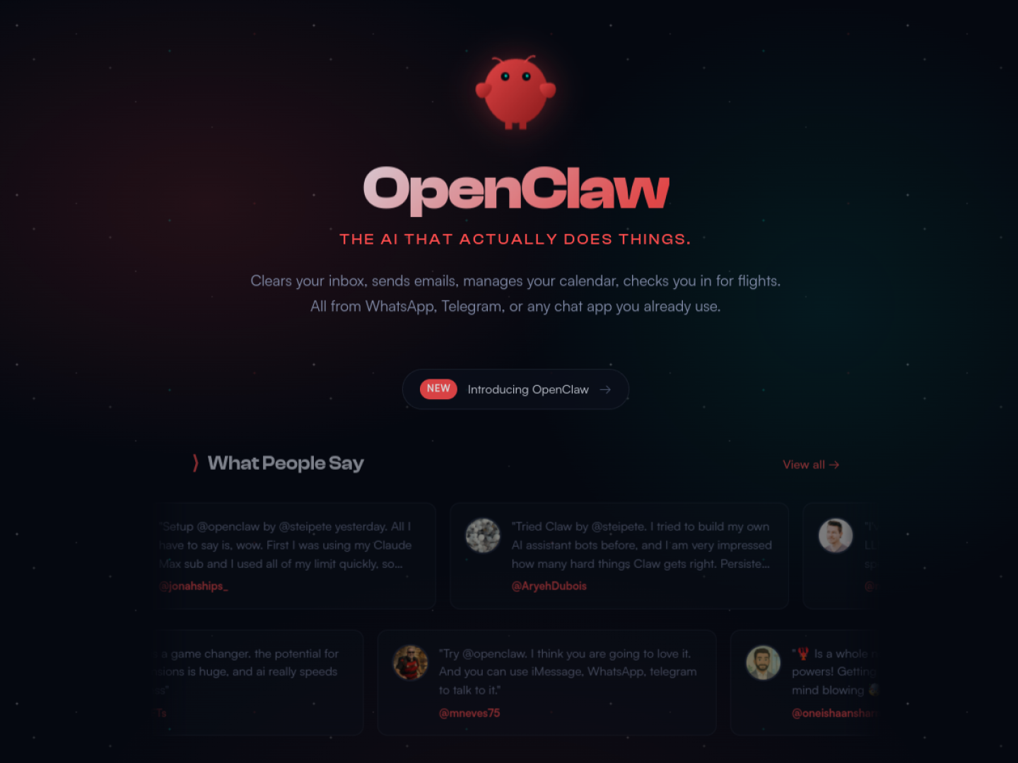
Looking sharp — https://openclaw.ai scores 71.61
You've built something solid. Here's how to level up.
Score Breakdown
Summary
This is a well-executed landing page with strong branding and visual appeal. The dark theme with coral accents creates a modern, tech-forward aesthetic that aligns well with the AI product positioning.
Strengths
Color & Contrast (79.95/100): The dark gradient background with light text creates strong contrast and readability
Visual Hierarchy (74.31/100): The OpenClaw logo and main heading create a strong focal point with clear visual weight
Component Consistency (72.08/100): Testimonial cards follow a consistent pattern with profile images and usernames
Areas for Improvement
Typography Issue 1
The main heading uses a bold, modern typeface that creates good brand presence
Recommendation
Establish a more consistent typographic scale across all text elements for better hierarchy
Spacing & Rhythm Issue 1
Good use of whitespace around the main hero section creates breathing room
Recommendation
Improve vertical rhythm consistency between different content sections
Micro-interactions Issue 1
The 'NEW' badge on the CTA button provides good visual prominence
Recommendation
Add hover states and better visual affordances to interactive elements like testimonial cards
Visual Hierarchy Issue 1
The OpenClaw logo and main heading create a strong focal point with clear visual weight
Recommendation
Increase contrast between the testimonial cards to better differentiate their hierarchy levels
Color & Contrast Issue 1
The dark gradient background with light text creates strong contrast and readability
Recommendation
Consider adding one more accent color to provide more strategic highlighting options
Component Consistency Issue 1
Testimonial cards follow a consistent pattern with profile images and usernames
Recommendation
Ensure all interactive elements share the same visual treatment and styling patterns
Screenshot Analyzed
Ready to level up your design?
A professional polish could push you to the next tier.