Solid Foundation with Room to Shine
Strong design system with clear paths to exceptional status
Score Breakdown
Summary
Your design demonstrates excellent component consistency and clean typography that creates a professional, cohesive experience. With a score of 74.12, you've built a solid foundation that's primed for optimization. A few strategic improvements could easily push you into elite territory.
Strengths
Exceptional component consistency across all interface elements
Clean figmaSans typography with well-proportioned type scale
Effective use of whitespace that focuses attention on key content
Areas for Improvement
Visual Hierarchy Issue 1
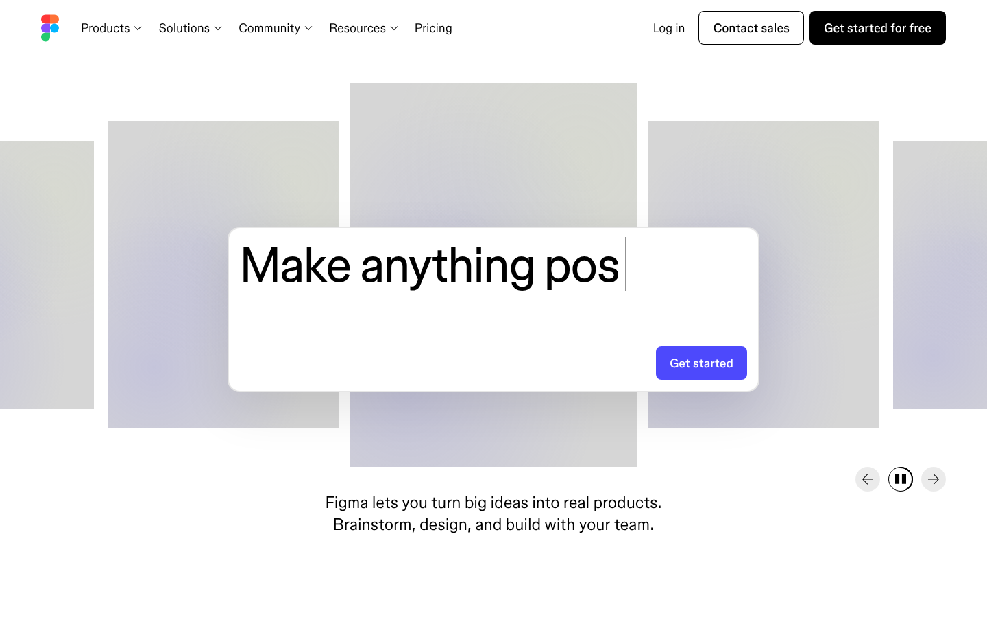
The main headline 'Make anything possible' creates a strong focal point with bold typography and center alignment
Recommendation
Increase size contrast between the main headline and supporting text to strengthen the hierarchy
Visual Hierarchy Issue 2
Information layering works well with clear primary content area and secondary navigation elements
Recommendation
Consider adding more visual separation between different content sections
Micro-interactions Issue 1
The 'Get started' button has strong visual affordance with its blue background and rounded corners
Recommendation
Add subtle hover states and transitions to enhance the interactive feel
Micro-interactions Issue 2
Navigation elements and interactive states appear polished and professional
Recommendation
Include loading states and micro-feedback for better user experience
Typography Issue 1
figmaSans provides excellent brand consistency and readability across all elements
Recommendation
Maintain the strong typographic foundation while ensuring consistent line-height ratios across all text elements
Color & Contrast Issue 1
The minimal color palette creates a clean, professional appearance that aligns with Figma's design tool brand
Recommendation
Ensure all text meets WCAG AA standards, particularly for lighter gray text elements
Spacing & Rhythm Issue 1
Generous whitespace creates breathing room and focuses attention on key content
Recommendation
Implement a more consistent baseline grid system for tighter vertical rhythm alignment
Component Consistency Issue 1
Strong design system consistency evident across navigation, buttons, and layout components
Recommendation
Continue maintaining the high standard of component consistency across all pages and states
Screenshot Analyzed
Ready to level up your design?
A professional polish could push you to the next tier.