Solid Foundation, Ready to Level Up
Strong brand execution with clear opportunities for optimization
Score Breakdown
Summary
Your design demonstrates professional execution with excellent typography and brand consistency. The foundation is solid, but addressing key spacing and interaction issues could elevate this to elite status.
Strengths
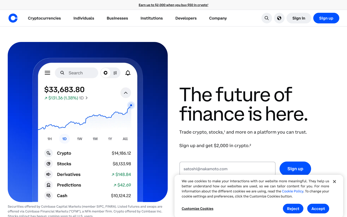
CoinbaseSans delivers excellent brand consistency and readability across all screens
Strong contrast ratios and well-designed blue accent create visual appeal
Responsive design maintains hierarchy effectively from desktop to mobile
Areas for Improvement
Spacing & Rhythm Issue 1
Responsive spacing works well between desktop and mobile with appropriate adjustments
Recommendation
Implement a more consistent grid system with 8px or 16px baseline
Spacing & Rhythm Issue 2
Some inconsistencies in vertical spacing between sections, particularly around form elements
Recommendation
Standardize vertical spacing between major page sections
Micro-interactions Issue 1
Sign up buttons are well-designed with clear visual prominence and brand-appropriate styling
Recommendation
Enhance feedback indicators for form validation and loading states
Micro-interactions Issue 2
Limited visibility of hover states and interactive feedback in the static screenshots
Recommendation
Ensure all interactive elements have clear hover and focus states
Visual Hierarchy Issue 1
The main headline 'The future of finance is here' serves as a strong focal point with substantial size difference from secondary elements
Recommendation
Increase contrast between secondary and tertiary information levels
Visual Hierarchy Issue 2
Mobile layout maintains hierarchy well with proper stacking of elements, though some secondary information could be more clearly distinguished
Recommendation
Consider using more visual weight differentiation in the mobile layout for better scanability
Typography Issue 1
CoinbaseSans provides excellent brand consistency and readability across all screen sizes
Recommendation
Fine-tune line spacing on mobile for optimal reading comfort
Typography Issue 2
Type scale appears well-structured with clear differentiation between heading levels and body text
Recommendation
Consider slightly increasing body text size on smaller screens
Color & Contrast Issue 1
Strong contrast ratios with black text on white backgrounds and well-designed blue accent color
Recommendation
Ensure all interactive states maintain WCAG AA compliance
Color & Contrast Issue 2
The blue gradient background adds visual interest while maintaining brand consistency
Recommendation
Consider adding more strategic use of accent colors to guide user attention
Screenshot Analyzed
Ready to level up your design?
A professional polish could push you to the next tier.