Strong Foundation, Ready for Elite Status
Professional design with excellent typography needs interactive polish
Score Breakdown
Summary
Your design demonstrates professional-level execution with outstanding typography and visual hierarchy. The clean aesthetic and strong focal points create an effective user experience, but strategic improvements to interactions and spacing could elevate this to elite tier.
Strengths
Exceptional Inter typography implementation with perfect readability
Strong visual hierarchy with excellent headline focal points
Clean, sophisticated color palette with high contrast ratios
Areas for Improvement
Spacing & Rhythm Issue 1
Generous whitespace creates breathing room and focuses attention on key content
Recommendation
Implement a more systematic grid structure to improve alignment consistency across components
Micro-interactions Issue 1
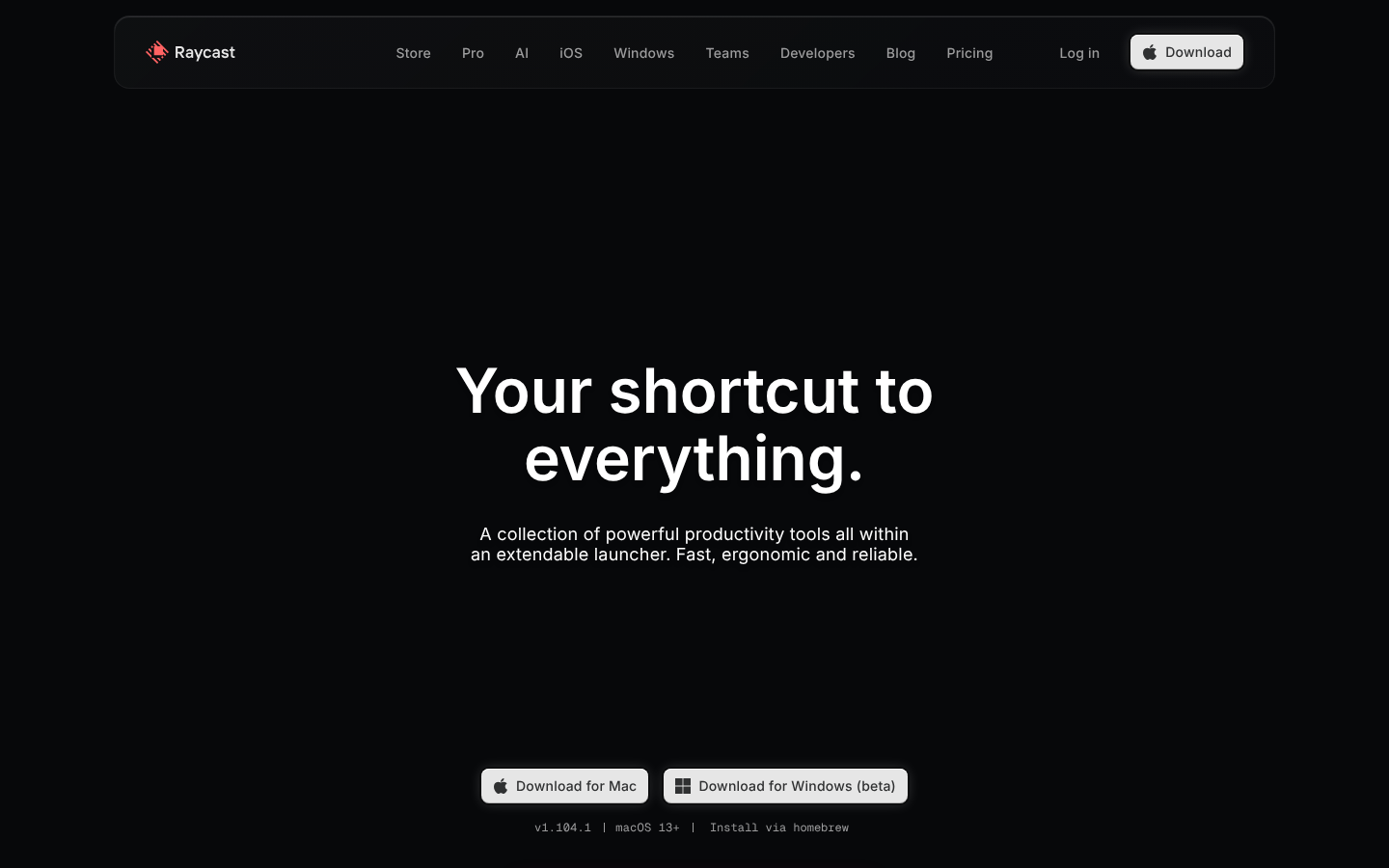
Download buttons have clear visual hierarchy but lack obvious interactive affordances
Recommendation
Add subtle hover animations and state changes to improve interactive clarity and perceived polish
Visual Hierarchy Issue 1
The hero headline 'Your shortcut to everything.' creates a strong focal point with excellent size contrast
Recommendation
Consider adding more visual weight to the secondary CTA to improve conversion paths
Typography Issue 1
Inter font family provides excellent readability and modern appeal across both desktop and mobile
Recommendation
Ensure consistent line-height ratios are maintained across all breakpoints for optimal reading rhythm
Color & Contrast Issue 1
High contrast white text on dark background ensures excellent readability
Recommendation
Consider adding subtle accent colors for better wayfinding and visual interest without compromising the clean aesthetic
Component Consistency Issue 1
Button styling shows good consistency between primary and secondary actions
Recommendation
Ensure icon treatments and visual weights remain consistent across all interactive elements and platforms
Screenshot Analyzed
Ready to level up your design?
A professional polish could push you to the next tier.